

Overview
A text archiving app for people who capture words and never find them again.
Live on the App Store · 5.0★ · v1.0.6
Year
2026
Role
UXUI Design (100%)
Services
Text Archiving App
Duration
7 Months
Why
Most OCR apps are built for a single moment: point, scan, copy, done. But that's not how people actually use them. In interviews, the same pattern kept coming up. People capture text they care about, then lose it in a camera roll they never revisit. The real gap wasn't recognition accuracy. It was the lack of a place to keep what they'd already captured.


Structure
Most of this structure exists to serve one action: finding something again months later. Categories are assigned at capture time so nothing needs filing afterward, and Home, Album, and Search each offer a different way in, by color, by list, by keyword. Nothing sits more than two taps deep.

A capture flow only feels simple until permission gets denied, the OCR misses the text, or someone backs out before saving. Each of those moments loops back into the main path instead of dead-ending, so a bad scan costs a retry, not a restart.

Key Decision
Filing scans away later, the way Photos or Notes do, felt like the safer choice. But finding something later meant scrolling through hundreds of unsorted screenshots, if anyone came back to look at all. Assigning a category the moment something's captured takes fewer taps overall, not more, since there's nothing left to sort afterward.

Key features
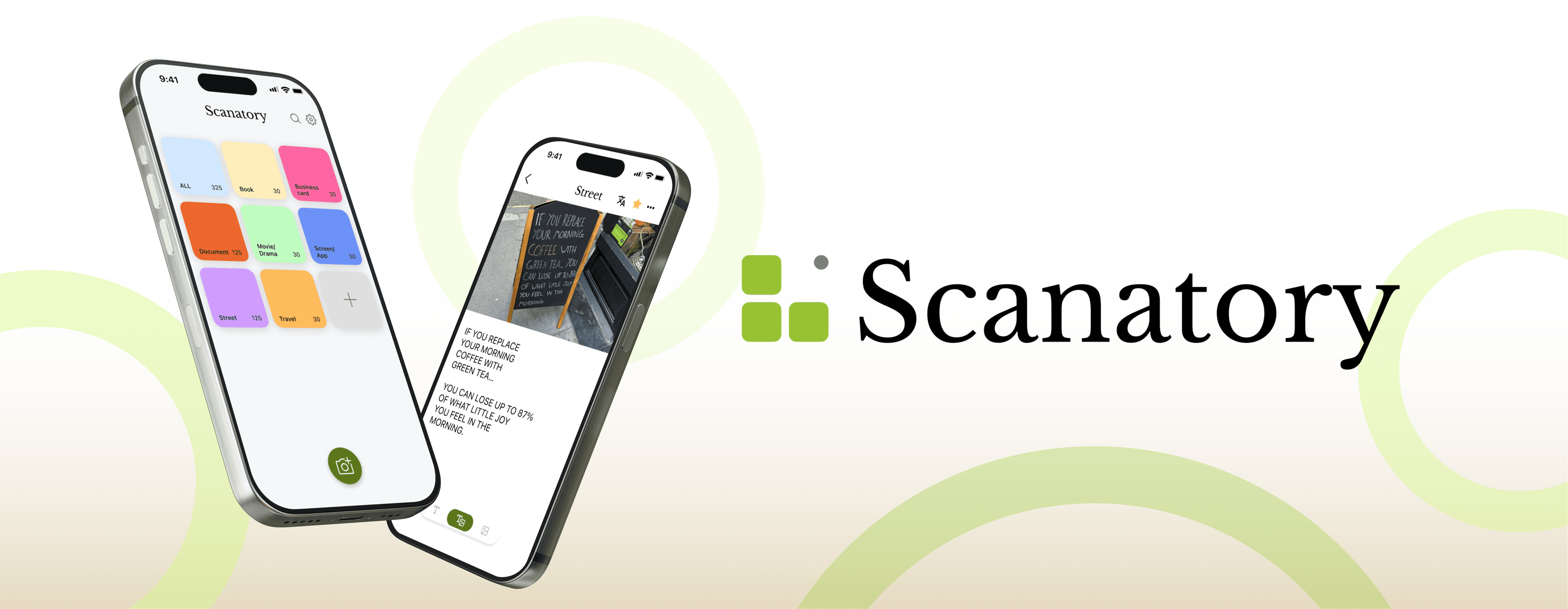
Home shows everything already sorted into folders, so finding what you archived and where takes one glance instead of a search. This is the part the whole app is built around: capturing something is easy, getting back to it later is the part that actually matters.

A street sign needs one clean shot. A ten-page menu needs several in a row. Switching modes changes the whole capture flow, not just a setting buried in a menu.

Scanning doesn't try to recognize text before you shoot. Take the photo, and it automatically pulls out every line of text in the frame, or crop down to just the part you meant to keep.

Each category opens into its own list, sorted newest first, with favorites pulled to the top. Finding one card among fifty doesn't mean scrolling past the other forty-nine.

Iteration
Feedback from the team and early users kept landing on the same word: clinical. I shifted the palette from cool, minimal tones to something warmer, aiming for the feel of a notebook you'd actually write in by hand rather than a utility screen for OCR output.

reviews
What's confirmed:
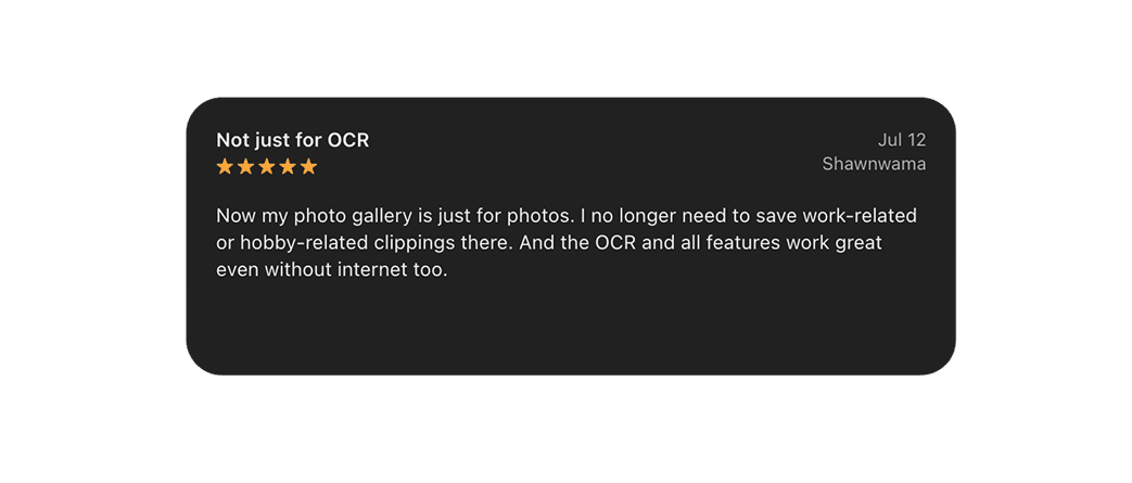
it's shipped, and people are using it to save text instead of screenshots, exactly what the research predicted.
What's still open:
whether that holds up past the first archive. Four reviews isn't enough to call a trend.
What's next:
watching whether translation, the feature added since launch, changes how often people come back.


Lessons Learned
This was the first app I designed that developers actually had to build and ship, not a portfolio mockup. Early on, I didn't know how to hand off screens in a way that was easy to implement, files that looked clean in Figma turned out awkward to build. We started meeting weekly, testing usability together and adjusting as the build progressed, and that's where I learned what a working app actually needs: not just a clean screen, but one that holds up once real code, edge cases, and real data hit it.
I'm carrying that habit into every project now: designing with the build in mind from day one, instead of treating implementation as a separate phase that happens after the screens are "done."